Quote:
Originally Posted by Hank Chinaski

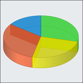
Red= Canadians with life threatening disease that die sooner than they would have if living under US Care
Blue= Canadians who live within an hour of a US border and can afford to pay for health care who use the US system more than once a year
Yellow= Canadians who live more than an hour from a US border
Green= Canadians who want to merge with the US, if we agree to throw out our new national health care law. |
I believe Hank's pie chart because it has the illusion of 3 dimensions.
Odd how that doesn't work for Hank.


